
FM

/home/u523506497/domains/mymelon.in/public_html/wp-admin/css UP

/*------------------------------------------------------------------------------
  14.0 - Media Screen
------------------------------------------------------------------------------*/

.media-item .describe {
	border-collapse: collapse;
	width: 100%;
	border-top: 1px solid #dcdcde;
	clear: both;
	cursor: default;
}

.media-item.media-blank .describe {
	border: 0;
}

.media-item .describe th {
	vertical-align: top;
	text-align: left;
	padding: 5px 10px 10px;
	width: 140px;
}

.media-item .describe .align th {
	padding-top: 0;
}

.media-item .media-item-info tr {
	background-color: transparent;
}

.media-item .describe td {
	padding: 0 8px 8px 0;
	vertical-align: top;
}

.media-item thead.media-item-info td {
	padding: 4px 10px 0;
}

.media-item .media-item-info .A1B1 {
	padding: 0 0 0 10px;
}

.media-item td.savesend {
	padding-bottom: 15px;
}

.media-item .thumbnail {
	max-height: 128px;
	max-width: 128px;
}

.media-list-subtitle {
	display: block;
}

.media-list-title {
	display: block;
}

#wpbody-content #async-upload-wrap a {
	display: none;
}

.media-upload-form {
	margin-top: 20px;
}

.media-upload-form td label {
	margin-right: 6px;
	margin-left: 2px;
}

.media-upload-form .align .field label {
	display: inline;
	padding: 0 0 0 23px;
	margin: 0 1em 0 3px;
	font-weight: 600;
}

.media-upload-form tr.image-size label {
	margin: 0 0 0 5px;
	font-weight: 600;
}

.media-upload-form th.label label {
	font-weight: 600;
	margin: 0.5em;
	font-size: 13px;
}

.media-upload-form th.label label span {
	padding: 0 5px;
}

.media-item .describe input[type="text"],
.media-item .describe textarea {
	width: 460px;
}

.media-item .describe p.help {
	margin: 0;
	padding: 0 0 0 5px;
}

.describe-toggle-on,
.describe-toggle-off {
	display: block;
	line-height: 2.76923076;
	float: right;
	margin-right: 10px;
}

.media-item .attachment-tools {
	display: flex;
	align-items: center;
}

.media-item .edit-attachment {
	padding: 14px 0;
	display: block;
	margin-right: 10px;
}

.media-item .edit-attachment.copy-to-clipboard-container {
	display: flex;
	margin-top: 0;
}

.media-item-copy-container .success {
	line-height: 0;
}

.media-item button .copy-attachment-url {
	margin-top: 14px;
}

.media-item .copy-to-clipboard-container {
	margin-top: 7px;
}

.media-item .describe-toggle-off,
.media-item.open .describe-toggle-on {
	display: none;
}

.media-item.open .describe-toggle-off {
	display: block;
}

.media-upload-form .media-item {
	min-height: 70px;
	margin-bottom: 1px;
	position: relative;
	width: 100%;
	background: #fff;
}

.media-upload-form .media-item,
.media-upload-form .media-item .error {
	box-shadow: 0 1px 0 #dcdcde;
}

#media-items:empty {
	border: 0 none;
}

.media-item .filename {
	padding: 14px 2px;
	overflow: hidden;
	margin-left: 4px;
}

.media-item .pinkynail {
	float: left;
	margin: 14px;
	max-height: 70px;
	max-width: 70px;
}

.media-item .startopen,
.media-item .startclosed {
	display: none;
}

.media-item .progress {
	display: inline-block;
	height: 22px;
	margin: 0 6px 7px;
	width: 200px;
	line-height: 2em;
	padding: 0;
	overflow: hidden;
	border-radius: 22px;
	background: #dcdcde;
	box-shadow: inset 0 1px 2px rgba(0, 0, 0, 0.1);
}

.media-item .bar {
	z-index: 9;
	width: 0;
	height: 100%;
	margin-top: -22px;
	border-radius: 22px;
	background-color: #2271b1;
	box-shadow: inset 0 0 2px rgba(0, 0, 0, 0.3);
}

.media-item .progress .percent {
	z-index: 10;
	position: relative;
	width: 200px;
	padding: 0;
	color: #fff;
	text-align: center;
	line-height: 22px;
	font-weight: 400;
	text-shadow: 0 1px 2px rgba(0, 0, 0, 0.2);
}

.upload-php .fixed .column-parent {
	width: 15%;
}

.js .html-uploader #plupload-upload-ui {
	display: none;
}

.js .html-uploader #html-upload-ui {
	display: block;
}

#html-upload-ui #async-upload {
	font-size: 1em;
}

.media-upload-form .media-item.error,
.media-upload-form .media-item .error {
	width: auto;
	margin: 0 0 1px;
}

.media-upload-form .media-item .error {
	padding: 10px 0 10px 14px;
	min-height: 50px;
}

.media-item .error-div button.dismiss {
	float: right;
	margin: 0 10px 0 15px;
}

/*------------------------------------------------------------------------------
  14.1 - Media Library
------------------------------------------------------------------------------*/

.find-box {
	background-color: #fff;
	box-shadow: 0 3px 6px rgba(0, 0, 0, 0.3);
	width: 600px;
	overflow: hidden;
	margin-left: -300px;
	position: fixed;
	top: 30px;
	bottom: 30px;
	left: 50%;
	z-index: 100105;
}

.find-box-head {
	background: #fff;
	border-bottom: 1px solid #dcdcde;
	height: 36px;
	font-size: 18px;
	font-weight: 600;
	line-height: 2;
	padding: 0 36px 0 16px;
	position: absolute;
	top: 0;
	left: 0;
	right: 0;
}

.find-box-inside {
	overflow: auto;
	padding: 16px;
	background-color: #fff;
	position: absolute;
	top: 37px;
	bottom: 45px;
	overflow-y: scroll;
	width: 100%;
	box-sizing: border-box;
}

.find-box-search {
	padding-bottom: 16px;
}

.find-box-search .spinner {
	float: none;
	left: 105px;
	position: absolute;
}

.find-box-search,
#find-posts-response {
	position: relative; /* RTL fix, #WP28010 */
}

#find-posts-input,
#find-posts-search {
	float: left;
}

#find-posts-input {
	width: 140px;
	height: 28px;
	margin: 0 4px 0 0;
}

.widefat .found-radio {
	padding-right: 0;
	width: 16px;
}

#find-posts-close {
	width: 36px;
	height: 36px;
	border: none;
	padding: 0;
	position: absolute;
	top: 0;
	right: 0;
	cursor: pointer;
	text-align: center;
	background: none;
	color: #646970;
}

#find-posts-close:hover,
#find-posts-close:focus {
	color: var(--wp-admin-theme-color-darker-20, #183ad6);
}

#find-posts-close:focus {
	box-shadow: 0 0 0 var(--wp-admin-border-width-focus, 1.5px) var(--wp-admin-theme-color, #3858e9);
	/* Only visible in Windows High Contrast mode */
	outline: 2px solid transparent;
	outline-offset: -2px;
}

#find-posts-close:before {
	font: normal 20px/36px dashicons;
	vertical-align: top;
	-webkit-font-smoothing: antialiased;
	-moz-osx-font-smoothing: grayscale;
	content: "\f158";
	content: "\f158" / '';
}

.find-box-buttons {
	padding: 8px 16px;
	background: #fff;
	border-top: 1px solid #dcdcde;
	position: absolute;
	bottom: 0;
	left: 0;
	right: 0;
}

@media screen and (max-width: 782px) {
	.find-box-inside {
		bottom: 57px;
	}

	#delete_all {
		margin-bottom: 0;
	}
}

@media screen and (max-width: 660px) {

	.find-box {
		top: 0;
		bottom: 0;
		left: 0;
		right: 0;
		margin: 0;
		width: 100%;
	}

}

.ui-find-overlay {
	position: fixed;
	top: 0;
	left: 0;
	right: 0;
	bottom: 0;
	background: #000;
	opacity: 0.7;
	filter: alpha(opacity=70);
	z-index: 100100;
}

.drag-drop #drag-drop-area {
	border: 4px dashed #c3c4c7;
	height: 200px;
}

.drag-drop .drag-drop-inside {
	margin: 60px auto 0;
	width: 250px;
}

.drag-drop-inside p {
	font-size: 14px;
	margin: 5px 0;
	display: none;
}

.drag-drop .drag-drop-inside p {
	text-align: center;
}

.drag-drop-inside p.drag-drop-info {
	font-size: 20px;
}

.drag-drop .drag-drop-inside p,
.drag-drop-inside p.drag-drop-buttons {
	display: block;
}

/*
#drag-drop-area:-moz-drag-over {
	border-color: #83b4d8;
}
border color while dragging a file over the uploader drop area */
.drag-drop.drag-over #drag-drop-area {
	border-color: #9ec2e6;
}

#plupload-upload-ui {
	position: relative;
}

.post-type-attachment .wp-filter select {
	margin: 0 6px 0 0;
}

/* Match the spacing the grid view toolbar gets from
   `.attachments-browser .media-toolbar` in media-views.css, so the Media
   Library filter bar is consistent in both modes. The grid view toolbar is
   excluded so that rule stays the single source of its own padding: media.css
   is printed after media-views.css here, so an unscoped rule would override
   it. */
.upload-php .wp-filter:not(.media-toolbar) {
	padding: 12px 16px;
}

/**
 * Media Library grid view
 */

.media-frame.mode-grid,
.media-frame.mode-grid .media-frame-content,
.media-frame.mode-grid .attachments-browser:not(.has-load-more) .attachments,
.media-frame.mode-grid .attachments-browser.has-load-more .attachments-wrapper,
.media-frame.mode-grid .uploader-inline-content {
	position: static;
}

/* Regions we don't use at all */
.media-frame.mode-grid .media-frame-title,
.media-frame.mode-grid .media-frame-router,
.media-frame.mode-grid .media-frame-menu {
	display: none;
}

.media-frame.mode-grid .media-frame-content {
	background-color: transparent;
	border: none;
}

.upload-php .mode-grid .media-sidebar {
	position: relative;
	width: auto;
	margin-top: 12px;
	padding: 0 16px;
	border-left: 4px solid #d63638;
	box-shadow: 0 1px 1px 0 rgba(0, 0, 0, 0.1);
	background-color: #fff;
}

.upload-php .mode-grid .hide-sidebar .media-sidebar {
	display: none;
}

.upload-php .mode-grid .media-sidebar .media-uploader-status {
	border-bottom: none;
	padding-bottom: 0;
	max-width: 100%;
}

.upload-php .mode-grid .media-sidebar .upload-error {
	margin: 12px 0;
	padding: 4px 0 0;
	border: none;
	box-shadow: none;
	background: none;
}

.upload-php .mode-grid .media-sidebar .media-uploader-status.errors h2 {
	display: none;
}

.media-frame.mode-grid .uploader-inline {
	position: relative;
	top: auto;
	right: auto;
	left: auto;
	bottom: auto;
	padding-top: 0;
	margin-top: 20px;
	border: 4px dashed #c3c4c7;
}

.media-frame.mode-select .attachments-browser.fixed:not(.has-load-more) .attachments,
.media-frame.mode-select .attachments-browser.has-load-more.fixed .attachments-wrapper {
	position: relative;
	top: 94px; /* prevent jumping up when the toolbar becomes fixed */
	padding-bottom: 94px; /* offset for above so the bottom doesn't get cut off */
}

.media-frame.mode-grid .attachment:focus,
.media-frame.mode-grid .selected.attachment:focus,
.media-frame.mode-grid .attachment.details:focus {
	/* Keep this box-shadow consistent between media.css and media-views.css. */
	box-shadow: inset 0 0 0 var(--wp-admin-border-width-focus, 1.5px) var(--wp-admin-theme-color, #3858e9);
	/* Only visible in Windows High Contrast mode */
	outline: 2px solid transparent;
	outline-offset: -6px;
}

.media-frame.mode-grid .selected.attachment {
	box-shadow:
		inset 0 0 0 5px #f0f0f1,
		inset 0 0 0 7px #c3c4c7;
}

.media-frame.mode-grid .attachment.details {
	box-shadow:
		inset 0 0 0 3px #f0f0f1,
		inset 0 0 0 7px var(--wp-admin-theme-color, #3858e9);
}

.media-frame.mode-grid.mode-select .attachment .thumbnail {
	opacity: 0.65;
}

.media-frame.mode-select .attachment.selected .thumbnail {
	opacity: 1;
}

.media-frame.mode-grid .media-toolbar {
	margin-bottom: 15px;
	height: auto;
	min-height: 80px;
}

.media-frame.mode-grid .media-toolbar label:not(.media-search-input-label) {
	border: 0;
	clip-path: inset(50%);
	height: 1px;
	margin: -1px;
	overflow: hidden;
	padding: 0;
	position: absolute;
	width: 1px;
	/* Many screen reader and browser combinations announce broken words as they would appear visually. */
	word-wrap: normal !important;
	word-break: normal !important;
}

.media-frame.mode-grid .media-toolbar select {
	margin: 0 10px 0 0;
	min-height: 32px;
	line-height: 2.14285714; /* 30px for 32px height with 14px font */
	padding: 0 24px 0 8px;
}

.media-frame.mode-grid .media-toolbar input[type="search"] {
	min-height: 32px;
	padding: 0 8px;
}

.media-frame.mode-grid .media-toolbar-secondary {
	display: flex;
	flex-wrap: wrap;
	align-items: center;
	gap: 8px;
}

.media-frame.mode-grid.mode-edit .media-toolbar-secondary > .select-mode-toggle-button {
	margin: 0 8px 0 0;
	height: 100%;
}

.media-frame.mode-grid .attachments-browser .bulk-select {
	display: inline-block;
	margin: 0 10px 0 0;
}

.media-frame.mode-grid .search {
	margin-top: 0;
}

.media-frame-content .media-search-input-label {
	vertical-align: baseline;
}

.attachments-browser .media-toolbar-secondary > .media-button {
	margin-right: 10px;
}

.media-frame.mode-select .attachments-browser.fixed .media-toolbar {
	position: fixed;
	top: 32px;
	left: auto;
	right: 20px;
	margin-top: 0;
}

.media-frame.mode-grid .attachments-browser {
	padding: 0;
}

.media-frame.mode-grid .attachments-browser .attachments {
	padding: 2px;
}

.media-frame.mode-grid .attachments-browser .no-media {
	color: #646970; /* same as no plugins and no themes */
	font-size: 18px;
	font-style: normal;
	margin: 0;
	padding: 100px 0 0;
	text-align: center;
}

/**
 * Attachment details modal
 */

.edit-attachment-frame {
	display: block;
	height: 100%;
	width: 100%;
}

.edit-attachment-frame .edit-media-header {
	overflow: hidden;
}

.upload-php .media-modal-close .media-modal-icon:before {
	content: "\f335";
	content: "\f335" / '';
	font-size: 22px;
}

.upload-php .media-modal-close,
.edit-attachment-frame .edit-media-header .left,
.edit-attachment-frame .edit-media-header .right {
	cursor: pointer;
	color: #787c82;
	background-color: transparent;
	height: 50px;
	width: 50px;
	padding: 0;
	position: absolute;
	text-align: center;
	border: 0;
	border-left: 1px solid #dcdcde;
	transition: color .1s ease-in-out, background .1s ease-in-out;
}

.upload-php .media-modal-close {
	top: 0;
	right: 0;
}

.edit-attachment-frame .edit-media-header .left {
	right: 102px;
}

.edit-attachment-frame .edit-media-header .right {
	right: 51px;
}

.edit-attachment-frame .media-frame-title {
	left: 0;
	right: 150px; /* leave space for prev/next/close */
}

.edit-attachment-frame .edit-media-header .right:before,
.edit-attachment-frame .edit-media-header .left:before {
	font: normal 20px/50px dashicons !important;
	display: inline;
	font-weight: 300;
}

.upload-php .media-modal-close:hover,
.upload-php .media-modal-close:focus,
.edit-attachment-frame .edit-media-header .left:hover,
.edit-attachment-frame .edit-media-header .right:hover,
.edit-attachment-frame .edit-media-header .left:focus,
.edit-attachment-frame .edit-media-header .right:focus {
	background: #dcdcde;
	border-color: #c3c4c7;
	color: #000;
	outline: none;
	box-shadow: none;
}

.upload-php .media-modal-close:focus,
.edit-attachment-frame .edit-media-header .left:focus,
.edit-attachment-frame .edit-media-header .right:focus {
	/* Only visible in Windows High Contrast mode */
	outline: 2px solid transparent;
	outline-offset: -2px;
}

.upload-php .media-modal-close:focus .media-modal-icon:before,
.upload-php .media-modal-close:hover .media-modal-icon:before {
	color: #000;
}

.edit-attachment-frame .edit-media-header .left:before {
	content: "\f341";
	content: "\f341" / '';
}

.edit-attachment-frame .edit-media-header .right:before {
	content: "\f345";
	content: "\f345" / '';
}

.edit-attachment-frame .edit-media-header [disabled],
.edit-attachment-frame .edit-media-header [disabled]:hover {
	color: #c3c4c7;
	background: inherit;
	cursor: default;
}

.edit-attachment-frame .media-frame-content,
.edit-attachment-frame .media-frame-router {
	left: 0;
}

.edit-attachment-frame .media-frame-content {
	border-bottom: none;
	bottom: 0;
	top: 50px;
}

.edit-attachment-frame .attachment-details {
	position: absolute;
	overflow: auto;
	top: 0;
	bottom: 0;
	right: 0;
	left: 0;
	box-shadow: inset 0 4px 4px -4px rgba(0, 0, 0, 0.1);
}

.edit-attachment-frame .attachment-media-view {
	float: left;
	width: 65%;
	height: 100%;
}

.edit-attachment-frame .attachment-media-view .thumbnail {
	box-sizing: border-box;
	padding: 16px;
	height: 100%;
}

.edit-attachment-frame .attachment-media-view .details-image {
	display: block;
	margin: 0 auto 16px;
	max-width: 100%;
	max-height: 90%;
	max-height: calc( 100% - 56px ); /* leave space for actions underneath */
	background-image: linear-gradient(45deg, #c3c4c7 25%, transparent 25%, transparent 75%, #c3c4c7 75%, #c3c4c7), linear-gradient(45deg, #c3c4c7 25%, transparent 25%, transparent 75%, #c3c4c7 75%, #c3c4c7);
	background-position: 0 0, 10px 10px;
	background-size: 20px 20px;
}

.edit-attachment-frame .attachment-media-view .details-image.icon {
	background: none;
}

.edit-attachment-frame .attachment-media-view .attachment-actions {
	text-align: center;
}

.edit-attachment-frame .wp-media-wrapper {
	margin-bottom: 12px;
}

.edit-attachment-frame input,
.edit-attachment-frame textarea {
	padding: 4px 8px;
	line-height: 1.42857143;
}

.edit-attachment-frame .attachment-info {
	overflow: auto;
	box-sizing: border-box;
	margin-bottom: 0;
	padding: 12px 16px 0;
	width: 35%;
	height: 100%;
	box-shadow: inset 0 4px 4px -4px rgba(0, 0, 0, 0.1);
	border-bottom: 0;
	border-left: 1px solid #dcdcde;
	background: #f6f7f7;
}

.edit-attachment-frame .attachment-info .details,
.edit-attachment-frame .attachment-info .settings {
	position: relative; /* RTL fix, #WP29352 */
	overflow: hidden;
	float: none;
	margin-bottom: 15px;
	padding-bottom: 15px;
	border-bottom: 1px solid #dcdcde;
}

.edit-attachment-frame .attachment-info .filename {
	font-weight: 400;
	color: #646970;
}

.edit-attachment-frame .attachment-info .thumbnail {
	margin-bottom: 12px;
}

.attachment-info .actions {
	margin-bottom: 16px;
}

.attachment-info .actions a {
	display: inline;
	text-decoration: none;
}

.copy-to-clipboard-container {
	display: flex;
	align-items: center;
	margin-top: 8px;
	clear: both;
}

.copy-to-clipboard-container .copy-attachment-url {
	white-space: normal;
}

.copy-to-clipboard-container .success {
	color: #007017;
	margin-left: 8px;
}

/*------------------------------------------------------------------------------
  14.2 - Image Editor
------------------------------------------------------------------------------*/
.wp_attachment_details .attachment-alt-text {
	margin-bottom: 5px;
}

.wp_attachment_details #attachment_alt {
	max-width: 500px;
	height: 3.28571428em;
}

.wp_attachment_details .attachment-alt-text-description {
	margin-top: 5px;
}

.wp_attachment_details label[for="content"] {
	font-size: 13px;
	line-height: 1.5;
	margin: 1em 0;
}

.wp_attachment_details #attachment_caption {
	height: 4em;
}

.describe .image-editor {
	vertical-align: top;
}

.imgedit-wrap {
	position: relative;
	padding-top: 10px;
}

.image-editor p,
.image-editor fieldset {
	margin: 8px 0;
}

.image-editor legend {
	margin-bottom: 5px;
}

.describe .imgedit-wrap .image-editor {
	padding: 0 5px;
}

.wp_attachment_holder div.updated {
	margin-top: 0;
}

.wp_attachment_holder .imgedit-wrap > div {
	height: auto;
}

.imgedit-panel-content {
	display: flex;
	flex-wrap: wrap;
	gap: 20px;
	margin-bottom: 20px;
}

.imgedit-settings {
	max-width: 240px; /* Prevent reflow when help info is expanded. */
}

.imgedit-group-controls > * {
	display: none;
}

.imgedit-panel-active .imgedit-group-controls > * {
	display: block;
}

.imgedit-panel-active .imgedit-group-controls > .imgedit-crop-apply {
	display: flex;
}

.imgedit-crop-apply {
	gap: 4px;
	flex-wrap: wrap;
}

.wp_attachment_holder .imgedit-wrap .image-editor {
	float: right;
	width: 250px;
}

.image-editor input {
	margin-top: 0;
	vertical-align: middle;
}

.imgedit-wait {
	position: absolute;
	top: 0;
	bottom: 0;
	width: 100%;
	background: #fff;
	opacity: 0.7;
	filter: alpha(opacity=70);
	display: none;
}

.imgedit-wait:before {
	content: "";
	display: block;
	width: 20px;
	height: 20px;
	position: absolute;
	left: 50%;
	top: 50%;
	margin: -10px 0 0 -10px;
	background: transparent url(../images/spinner.gif) no-repeat center;
	background-size: 20px 20px;
	transform: translateZ(0);
}

.no-float {
	float: none;
}

.media-disabled,
.image-editor .disabled {
	/* WCAG 1.4.3 Text or images of text that are part of an inactive user
	   interface component ... have no contrast requirement. */
	color: #a7aaad;
}

.A1B1 {
	overflow: hidden;
}

.wp_attachment_image .button,
.A1B1 .button {
	float: left;
}

.no-js .wp_attachment_image .button {
	display: none;
}

.wp_attachment_image .spinner,
.A1B1 .spinner {
	float: left;
}

.imgedit-menu .note-no-rotate {
	clear: both;
	margin: 0;
	padding: 1em 0 0;
}

.imgedit-menu .button:after,
.imgedit-menu .button:before {
	font: normal 16px/1 dashicons;
	margin-right: 8px;
	vertical-align: middle;
	position: relative;
	top: -2px;
	-webkit-font-smoothing: antialiased;
	-moz-osx-font-smoothing: grayscale;
}

.imgedit-menu .imgedit-rotate.button:after {
	content: '\f140';
	margin-left: 2px;
	margin-right: 0;
}

.imgedit-menu .imgedit-rotate.button[aria-expanded="true"]:after {
	content: '\f142';
}

.imgedit-menu .button.disabled {
	color: #a7aaad;
	border-color: #dcdcde;
	background: #f6f7f7;
	box-shadow: none;
	text-shadow: 0 1px 0 #fff;
	cursor: default;
	transform: none;
}

.imgedit-crop:before {
	content: "\f165";
	content: "\f165" / '';
}

.imgedit-scale:before {
	content: "\f211";
	content: "\f211" / '';
}

.imgedit-rotate:before {
	content: "\f167";
	content: "\f167" / '';
}

.imgedit-undo:before {
	content: "\f171";
	content: "\f171" / '';
}

.imgedit-redo:before {
	content: "\f172";
	content: "\f172" / '';
}

.imgedit-crop-wrap {
	position: relative;
}

.imgedit-crop-wrap img {
	background-image: linear-gradient(45deg, #c3c4c7 25%, transparent 25%, transparent 75%, #c3c4c7 75%, #c3c4c7), linear-gradient(45deg, #c3c4c7 25%, transparent 25%, transparent 75%, #c3c4c7 75%, #c3c4c7);
	background-position: 0 0, 10px 10px;
	background-size: 20px 20px;
}

.imgedit-crop-wrap {
	padding: 20px;
	background-image: linear-gradient(45deg, #c3c4c7 25%, transparent 25%, transparent 75%, #c3c4c7 75%, #c3c4c7), linear-gradient(45deg, #c3c4c7 25%, transparent 25%, transparent 75%, #c3c4c7 75%, #c3c4c7);
	background-position: 0 0, 10px 10px;
	background-size: 20px 20px;
}


.imgedit-crop {
	margin: 0 8px 0 0;
}

.imgedit-rotate {
	margin: 0 8px 0 3px;
}

.imgedit-undo {
	margin: 0 3px;
}

.imgedit-redo {
	margin: 0 8px 0 3px;
}

.imgedit-thumbnail-preview-group {
	display: flex;
	flex-wrap: wrap;
	column-gap: 10px;
}

.imgedit-thumbnail-preview {
	margin: 10px 8px 0 0;
}

.imgedit-thumbnail-preview-caption {
	display: block;
}

#poststuff .imgedit-group-top h2 {
	display: inline-block;
	margin: 0;
	padding: 0;
	font-size: 14px;
	line-height: 1.4;
}

#poststuff .imgedit-group-top .button-link {
	text-decoration: none;
	color: #1d2327;
}

.imgedit-applyto .imgedit-label {
	display: block;
	padding: .5em 0 0;
}

.imgedit-popup-menu,
.imgedit-help {
	display: none;
	padding-bottom: 8px;
}

.imgedit-panel-tools > .imgedit-menu {
	display: flex;
	column-gap: 4px;
	align-items: flex-start;
	flex-wrap: wrap;
}

.imgedit-popup-menu {
	width: calc( 100% - 20px );
	position: absolute;
	background: #fff;
	padding: 10px;
	box-shadow: 0 3px 6px rgba(0, 0, 0, 0.3);
}

.image-editor .imgedit-menu .imgedit-popup-menu button {
	display: block;
	margin: 2px 0;
	width: 100%;
	white-space: break-spaces;
	line-height: 1.5;
	padding-top: 3px;
	padding-bottom: 2px;
}

.imgedit-rotate-menu-container {
	position: relative;
}

.imgedit-help.imgedit-restore {
	padding-bottom: 0;
}

/* higher specificity than buttons */
.image-editor .imgedit-settings .imgedit-help-toggle,
.image-editor .imgedit-settings .imgedit-help-toggle:hover,
.image-editor .imgedit-settings .imgedit-help-toggle:active {
	border: 1px solid transparent;
	margin: -1px 0 0 -1px;
	padding: 0;
	background: transparent;
	color: var(--wp-admin-theme-color);
	font-size: 20px;
	line-height: 1;
	cursor: pointer;
	box-sizing: content-box;
	box-shadow: none;
}

.image-editor .imgedit-settings .imgedit-help-toggle:focus {
	color: var(--wp-admin-theme-color);
	border-color: var(--wp-admin-theme-color);
	box-shadow: 0 0 0 1px var(--wp-admin-theme-color);
	/* Only visible in Windows High Contrast mode */
	outline: 2px solid transparent;
}

.form-table td.imgedit-response {
	padding: 0;
}

.imgedit-submit-btn {
	margin-left: 20px;
}

.imgedit-wrap .nowrap {
	white-space: nowrap;
	font-size: 12px;
	line-height: inherit;
}

span.imgedit-scale-warn {
	display: flex;
	align-items: center;
	margin: 4px;
	gap: 4px;
	color: #b32d2e;
	font-style: normal;
	visibility: hidden;
	vertical-align: middle;
}

.imgedit-save-target {
	margin: 8px 0;
}

.imgedit-save-target legend {
	font-weight: 600;
}

.imgedit-group {
	margin-bottom: 20px;
}

.image-editor .imgedit-original-dimensions {
	display: inline-block;
}

.image-editor .imgedit-scale-controls input[type="text"],
.image-editor .imgedit-crop-ratio input[type="text"],
.image-editor .imgedit-crop-sel input[type="text"],
.image-editor .imgedit-scale-controls input[type="number"],
.image-editor .imgedit-crop-ratio input[type="number"],
.image-editor .imgedit-crop-sel input[type="number"] {
	width: 80px;
	font-size: 14px;
	padding: 0 8px;
}

.imgedit-separator {
	display: inline-block;
	width: 7px;
	text-align: center;
	font-size: 13px;
	color: #3c434a;
}

.image-editor .imgedit-scale-button-wrapper {
	margin-top: 0.3077em;
	display: block;
}

.image-editor .imgedit-scale-controls .button {
	margin-bottom: 0;
}

audio, video {
	display: inline-block;
	max-width: 100%;
}

.wp-core-ui .mejs-container {
	width: 100%;
	max-width: 100%;
}

.wp-core-ui .mejs-container * {
	box-sizing: border-box;
}

.wp-core-ui .mejs-time {
	box-sizing: content-box;
}

/* =Media Queries
-------------------------------------------------------------- */

/**
 * HiDPI Displays
 */
@media print,
  (min-resolution: 120dpi) {
	.imgedit-wait:before {
		background-image: url(../images/spinner-2x.gif);
	}
}

@media screen and (max-width: 782px) {
	.edit-attachment-frame input,
	.edit-attachment-frame textarea {
		line-height: 1.5;
	}

	.wp_attachment_details label[for="content"] {
		font-size: 14px;
		line-height: 1.5;
	}

	.wp_attachment_details textarea {
		line-height: 1.5;
	}

	.wp_attachment_details #attachment_alt {
		height: 3.375em;
	}

	.media-upload-form .media-item.error,
	.media-upload-form .media-item .error {
		font-size: 13px;
		line-height: 1.5;
	}

	.media-upload-form .media-item.error {
		padding: 1px 10px;
	}

	.media-upload-form .media-item .error {
		padding: 10px 0 10px 12px;
	}

	.image-editor .imgedit-scale input[type="text"],
	.image-editor .imgedit-crop-ratio input[type="text"],
	.image-editor .imgedit-crop-sel input[type="text"] {
		font-size: 16px;
		padding: 6px 10px;
	}

	.wp_attachment_holder .imgedit-wrap .imgedit-panel-content,
	.wp_attachment_holder .imgedit-wrap .image-editor {
		float: none;
		width: auto;
		max-width: none;
		padding-bottom: 16px;
	}

	.copy-to-clipboard-container .success {
		font-size: 14px;
	}

	/* Restructure image editor on narrow viewports. */
	.imgedit-crop-wrap img{
		width: 100%;
	}

	.media-modal .imgedit-wrap .imgedit-panel-content,
	.media-modal .imgedit-wrap .image-editor {
		position: initial !important;
	}

	.media-modal .imgedit-wrap .image-editor {
		box-sizing: border-box;
		width: 100% !important;
	}

	.image-editor .imgedit-scale-button-wrapper {
		display: inline-block;
	}
}

@media only screen and (max-width: 600px) {
	.media-item-wrapper {
		grid-template-columns: 1fr;
	}
}

/**
 * Media queries for media grid.
 */
@media only screen and (max-width: 1120px) {
	/* override for media-views.css */
	#wp-media-grid .wp-filter .attachment-filters {
		max-width: 100%;
	}
}

@media only screen and (max-width: 1000px) {
	/* override for forms.css */
	.wp-filter p.search-box {
		float: none;
		width: 100%;
		display: flex;
		flex-wrap: nowrap;
		column-gap: 0;
	}

	.wp-filter p.search-box #media-search-input {
		width: 100%;
	}

}

@media only screen and (max-width: 782px) {
	.media-frame.mode-select .attachments-browser.fixed .media-toolbar {
		top: 46px;
		right: 10px;
	}

	.media-frame.mode-grid .media-toolbar select {
		min-height: 40px;
		padding: 0 24px 0 12px;
	}

	.media-frame.mode-grid .media-toolbar input[type="search"] {
		min-height: 40px;
		padding: 0 12px;
	}

	.wp-filter p.search-box {
		margin-bottom: 0;
	}
}

@media only screen and (max-width: 600px) {
	.media-frame.mode-select .attachments-browser.fixed .media-toolbar {
		top: 0;
	}
}

@media only screen and (max-width: 480px) {
	.edit-attachment-frame .media-frame-title {
		right: 110px;
	}

	.upload-php .media-modal-close,
	.edit-attachment-frame .edit-media-header .left,
	.edit-attachment-frame .edit-media-header .right {
		width: 40px;
		height: 40px;
	}

	.edit-attachment-frame .edit-media-header .right:before,
	.edit-attachment-frame .edit-media-header .left:before {
		line-height: 40px !important;
	}

	.edit-attachment-frame .edit-media-header .left {
		right: 82px;
	}

	.edit-attachment-frame .edit-media-header .right {
		right: 41px;
	}

	.edit-attachment-frame .media-frame-content {
		top: 40px;
	}

	.edit-attachment-frame .attachment-media-view {
		float: none;
		height: auto;
		width: 100%;
	}

	.edit-attachment-frame .attachment-info {
		height: auto;
		width: 100%;
	}
}

@media only screen and (max-width: 640px), screen and (max-height: 400px) {
	.upload-php .mode-grid .media-sidebar{
		max-width: 100%;
	}
}

@media only screen and (max-width: 375px) {
	.media-item .attachment-tools {
		align-items: baseline;
	}
	.media-item .edit-attachment.copy-to-clipboard-container {
		flex-direction: column;
	}

	.copy-to-clipboard-container .success {
		line-height: normal;
		margin-top: 10px;
	}
}
about-rtl.css28566V
about-rtl.min.css22072V
about.css28532V
about.min.css22073V
admin-menu-rtl.css18877V
admin-menu-rtl.min.css15307V
admin-menu.css18827V
admin-menu.min.css15292V
code-editor-rtl.css1618V
code-editor-rtl.min.css1439V
code-editor.css1579V
code-editor.min.css1435V
color-picker-rtl.css3957V
color-picker-rtl.min.css3201V
color-picker.css3919V
color-picker.min.css3198V
colors-
common-rtl.css81868V
common-rtl.min.css62410V
common.css81782V
common.min.css62359V
customize-controls-rtl.css72569V
customize-controls-rtl.min.css60473V
customize-controls.css72491V
customize-controls.min.css60430V
customize-nav-menus-rtl.css22662V
customize-nav-menus-rtl.min.css18526V
customize-nav-menus.css22616V
customize-nav-menus.min.css18515V
customize-widgets-rtl.css13594V
customize-widgets-rtl.min.css10384V
customize-widgets.css13557V
customize-widgets.min.css10382V
dashboard-rtl.css30423V
dashboard-rtl.min.css23351V
dashboard.css30392V
dashboard.min.css23355V
deprecated-media-rtl.css6654V
deprecated-media-rtl.min.css5497V
deprecated-media.css6615V
deprecated-media.min.css5493V
edit-rtl.css40217V
edit-rtl.min.css31776V
edit.css40170V
edit.min.css31764V
farbtastic-rtl.css647V
farbtastic-rtl.min.css538V
farbtastic.css611V
farbtastic.min.css537V
forms-rtl.css39998V
forms-rtl.min.css31034V
forms.css39965V
forms.min.css31036V
install-rtl.css6620V
install-rtl.min.css5368V
install.css6587V
install.min.css5370V
l10n-rtl.css4579V
l10n-rtl.min.css3204V
l10n.css4540V
l10n.min.css3200V
list-tables-rtl.css46949V
list-tables-rtl.min.css38138V
list-tables.css46888V
list-tables.min.css38112V
login-rtl.css8841V
login-rtl.min.css6968V
login.css8800V
login.min.css6962V
media-rtl.css28940V
media-rtl.min.css22992V
media.css28889V
media.min.css22976V
nav-menus-rtl.css18143V
nav-menus-rtl.min.css14327V
nav-menus.css18081V
nav-menus.min.css14300V
revisions-rtl.css10767V
revisions-rtl.min.css8812V
revisions.css10720V
revisions.min.css8800V
site-health-rtl.css6503V
site-health-rtl.min.css5376V
site-health.css6462V
site-health.min.css5370V
site-icon-rtl.css4648V
site-icon-rtl.min.css3948V
site-icon.css4603V
site-icon.min.css3938V
themes-rtl.css44420V
themes-rtl.min.css34619V
themes.css44362V
themes.min.css34596V
view-transitions.css185V
view-transitions.min.css192V
widgets-rtl.css17887V
widgets-rtl.min.css14622V
widgets.css17850V
widgets.min.css14620V
wp-admin-rtl.css490V
wp-admin-rtl.min.css550V
wp-admin.css395V
wp-admin.min.css490V
wp-tooltip-rtl.css3073V
wp-tooltip-rtl.min.css2284V
wp-tooltip.css3034V
wp-tooltip.min.css2280V
Agile, Data-Driven Marketers Will Win 2024 (Part 2)
Skip to content Skip to sidebar Skip to footer

Agile, Data-Driven Marketers Will Win 2024 (Part 2)

In Part 1 of Agile Marketing series,  we looked at the fundamental concepts of Agile and data-driven marketing and their ultimate significance. Now, in this part, we’ve examined advanced techniques & trends shaping Agile and data-driven marketing.

Advanced Data-Driven Insights…

In a data-driven marketing arena, gaining deeper insights from data is crucial. Advanced techniques such as predictive analytics, sentiment analysis, and advanced data visualization are taking center stage. These methods allow marketers to extract valuable information from vast datasets enabling them to make more informed decisions and create highly targeted campaigns.

Predictive Analytics

Predictive analytics uses historical data and machine learning algorithms to forecast future trends and outcomes. It enables marketers to anticipate customer behavior and preferences, optimize marketing strategies, and allocate resources more effectively.

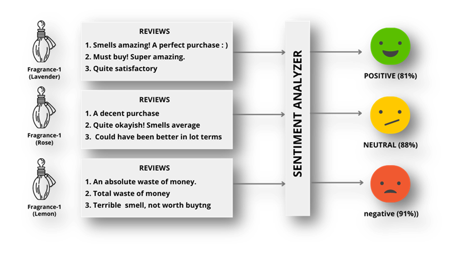
Sentiment Analysis

Sentiment analysis also known as opinion mining determines the sentiment or emotional tone of text data. This technique is particularly valuable for understanding customer opinions and feedback on social media, product reviews, and customer support interactions.

By continuously monitoring customer reactions, sentiment analysis helps track significant shifts in consumer behaviors and attitudes about products. 
Advanced-Data Visualization

Advanced data visualization tools go beyond basic charts and graphs. They use interactive visuals such as heatmaps, network diagrams, and geographical mapping, to help marketers gain deeper insights from complex datasets. Data visualization tools enable marketers to spot patterns, trends, and correlations that might be challenging to identify through raw data alone.

Consider a global e-commerce platform that uses advanced data visualization to track user behavior on its website. They can create interactive dashboards that show how users from different regions navigate the site which products are popular in specific locations, and where users tend to drop off in the conversion funnel. This insight can inform localized marketing strategies and website optimizations.

Leveraging AI & Machine Learning

Artificial Intelligence (AI) and Machine Learning (ML) are revolutionizing data-driven marketing. These technologies enable marketers to automate tasks, personalize experiences, and make data-driven decisions at scale.

Chatbots

AI-powered conversational agents that interact with users in real-time. They can answer questions, provide product recommendations, and even assist with purchases. Research by Grand View Research estimates that the chatbot market size will reach $1.25 billion by 2025.

Recommendation Engines…

Recommendation engines, powered by ML algorithms, analyze user behavior and preferences to suggest relevant products or content. These engines are prevalent in e-commerce, streaming services, and content platforms.

Companies like Amazon and Netflix excel in this domain. Amazon’s recommendation engine drives approximately 35% of its total revenue by recommending products that users are likely to purchase based on their browsing and purchase history.

Emerging Marketing Channels

The marketing landscape continues to evolve with the emergence of new channels driven by data and technology. Let’s explore some of these channels and how they are reshaping marketing strategies.

Voice Search

Voice search is becoming increasingly popular with the proliferation of voice-activated devices like smartphones and smart speakers. Optimizing content for voice search is essential as it requires a different approach than traditional text-based search engine optimization (SEO).

Brands are adapting by creating content that answers voice queries and optimizing their websites for voice-based interactions.

Augmented Reality (AR) and Virtual Reality (VR) Marketing

AR and VR technologies offer immersive experiences for users as they showcase products, offer virtual tours, and create interactive brand experiences. The AR & VR market worldwide is projected to grow by 13.72% (2023-2027) resulting in a market volume of US$52.05bn in 2027

IKEA has adopted AR to allow customers to visualize furniture in their homes before making a purchase decision, enhancing the shopping experience.

The Role of Data in Content Creation

Data is reshaping content creation. Advanced strategies like dynamic content generation and AI-driven content recommendation engines are driving content success.

Dynamic Content Generation

Dynamic content generation involves creating content that adapts in real-time based on user interactions or preferences. It’s particularly useful in email marketing, where personalized content can significantly improve engagement and conversion rates.

Consider an e-commerce company sending personalized product recommendations in their email campaigns. Dynamic content generation can ensure that each recipient sees products tailored to their interests and past browsing behavior.

It’s no wonder that 65% of marketing executives cite dynamic content in email marketing as the most effective personalization tactic.

AI-Driven Content Recommendation Engines

Content recommendation engines use machine learning algorithms to suggest articles, videos, products, or other content based on a user’s past behavior. These engines are prevalent in content platforms like news websites and streaming services.

Amazon is one of the country’s leading e-commerce platforms, offering a vast selection of products including electronics, clothing, books & more. To provide a highly personalized shopping experience to its users, Amazon employs an advanced AI-driven recommendation engine.

User Behavior Tracking… As users interact with the Amazon India website or mobile app, the recommendation engine continuously tracks their behavior:

Product Views… It monitors which products users view, the categories they explore, and how much time they spend on each product page.

Search Queries… The engine records the search queries users enter, which may indicate their current shopping interests or needs.

Purchase History… For registered users, the engine tracks their purchase history, including the types of products they buy, brands they prefer and price ranges they typically shop within.

User Interactions… It considers user interactions such as adding items to the cart, wishlisting products, and leaving product reviews.

Machine Learning Algorithms… Amazon’s recommendation engine relies on sophisticated machine learning algorithms including collaborative filtering, natural language processing (NLP), and deep learning, to analyze this vast amount of user data.

Here’s how the AI-driven recommendation engine operates in real-time: –

Anika, a registered user, opens the Amazon app on her smartphone to shop for a new laptop.

Real-Time Tracking… The engine detects Anika’s presence on the platform and begins tracking her behavior.

Current Behavior… Anika starts by entering her search query, “laptop for graphic design.”

Immediate Suggestions… In real-time, as Anika browses through the search results and laptop listings, the AI-driven engine generates immediate suggestions:

It recommends laptops known for their performance in graphic design such as those with powerful processors and dedicated graphics cards.

It highlights laptops from brands that Anika has previously purchased or shown interest in.

It offers a range of laptops across different price points, including options for budget-conscious shoppers and premium models.

Continuous Learning… As Anika adds laptops to her cart and compares different models, the recommendation engine learns from her real-time behavior. It understands that she is seeking a laptop that balances performance and affordability.

Dynamic Recommendations… After Anika makes her purchase, the recommendation engine continues to provide a personalized experience.

It updates her profile with her most recent purchase, influencing future recommendations.

It may suggest laptop accessories such as laptop bags or external hard drives based on her recent purchase.

The outcome…

Anika is delighted with her shopping experience on Amazon. She finds the personalized laptop recommendations helpful, saving her time in selecting the right product. This level of personalization keeps Anika engaged on the platform and encourages her to return for future purchases.

So, ultimately Amazon’s AI-driven content recommendation engine enhances user engagement and satisfaction, ultimately benefiting both users like Anika and Amazon India’s business growth as an e-commerce platform.

For a comprehensive read – How Does The Algorithm Of The eCommerce Giant Work?

To Conclude

From predictive analytics to hyper-personalization and ethical data practices, the future of marketing belongs to those who harness the power of data while respecting consumer privacy.

As we move forward, the ability to adapt quickly and make data-driven decisions with precision will continue to be the hallmark of successful marketers. Stay informed, adapt, and be ready for the dynamic world of marketing in the years ahead…

 

Leave a comment